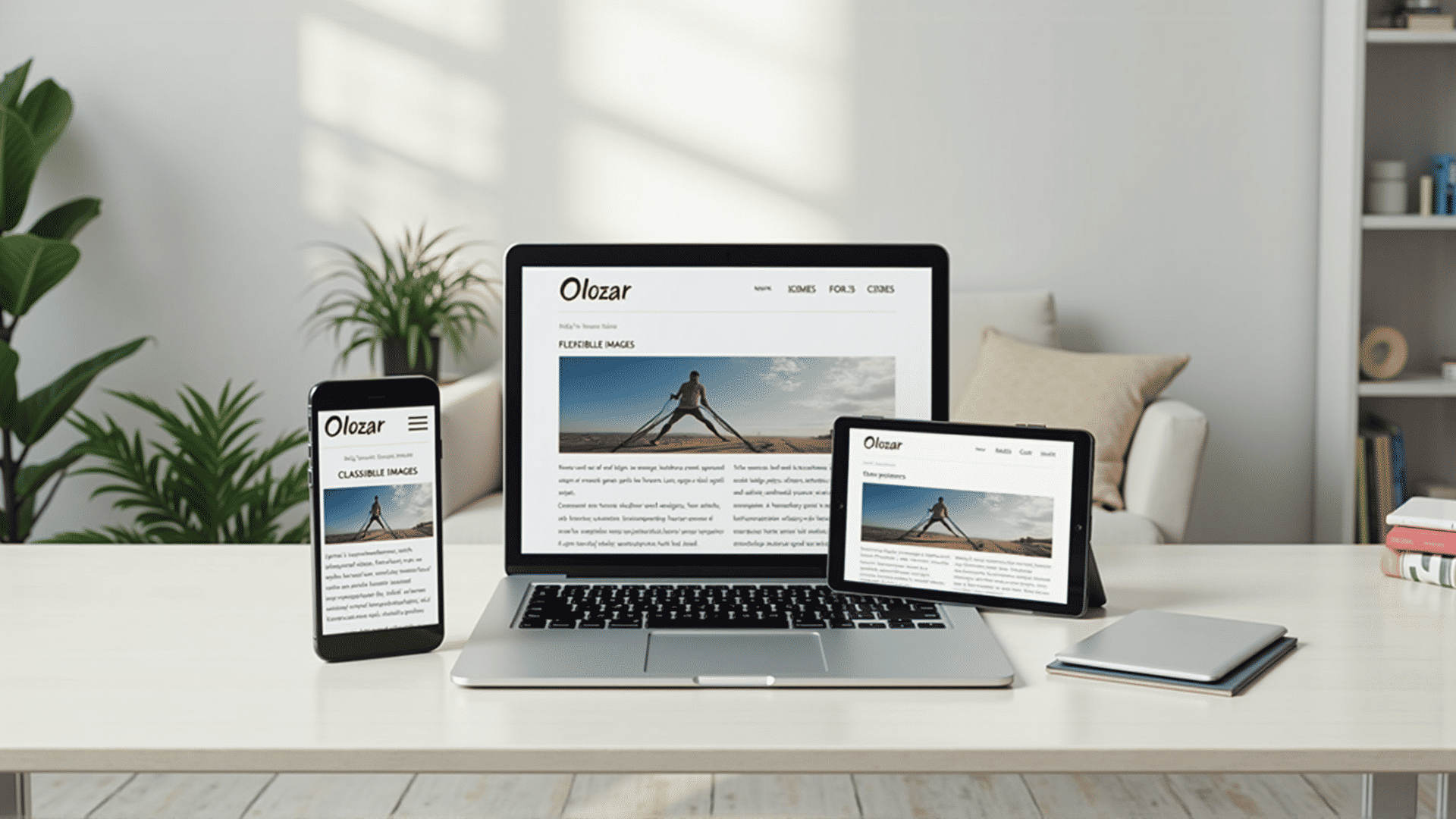
In today’s digital landscape, the way individuals access information online is continuously evolving. Gone are the days when websites were solely accessed through large desktop computers. Now, with a variety of devices available, including smartphones, tablets, and laptops, website developers face the challenge of ensuring that their sites perform seamlessly across all platforms. This is where creating adaptable site formats becomes crucial.
The primary focus of crafting adaptable sites is to ensure that web pages are user-friendly, regardless of the device or screen size being used. This approach enhances the user experience, as it eliminates the need for excessive scrolling, zooming, or pinching, which can be both frustrating and time-consuming for users. Whether viewed on a small smartphone screen or a large desktop monitor, the content should be presented consistently and be easy to navigate.
One of the critical elements of designing for different devices is fluid grid layouts. Unlike traditional fixed-width layouts, fluid grids are structured using percentages rather than fixed measurements. This flexibility allows webpage elements to scale in size according to the device's screen, offering a coherent and aesthetically pleasing view, no matter the resolution.
Another key aspect is the use of flexible images and media. By applying techniques such as CSS to control how images scale, images automatically adjust to fit the screen without losing quality or the site's overall layout integrity. This ensures that visuals are just as engaging and clear whether they are viewed on a smartphone or a tablet.
CSS media queries also play a significant role in this design strategy. Media queries allow developers to tailor their site's aesthetics to different devices by changing its style based on conditions like screen width, height, or orientation. Through media queries, specific CSS styles can be applied only if certain conditions are met, enabling developers to alter font sizes, colors, or even remove certain elements that may not be necessary for a smaller screen.
Additionally, touch-friendly design is essential for optimizing the experience on tablet and smartphone devices. Making buttons and interactive elements larger and easier to click with a finger, rather than a mouse pointer, can make a significant difference in usability.
Search engine optimization also benefits from such adaptable design methods. Search engines take into account the accessibility of websites on various devices as part of their ranking algorithms. Thus, sites that are easily accessible and provide a good user experience across different platforms may rank higher in search engine results.
It is essential for developers and designers to embrace these modern techniques, considering the ever-increasing diversity of devices used to access the web. Investing time and resources in creating adaptable web structures not only enhances user satisfaction but also keeps the site ahead of the competition in the constantly evolving digital environment.